Confirm Modal
Overview
When requiring users to interact with the application, but without jumping to a new page and interrupting the user's workflow, you can use Modal to create a new floating layer over the current page to get user feedback or display information.
-In this article, we will show what has been customized with the confirm modal -Use Modal.useModal to get contextHolder with context accessible issue. Only hooks method support Promise await operation.
Passing okButtonProps and cancelButtonProps will customize the OK button and cancel button props.
When To Use
When requiring users to interact with the application, but without jumping to a new page and interrupting the user's workflow, you can use Modal to create a new floating layer over the current page to get user feedback or display information.
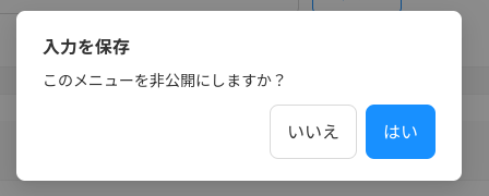
Some properties have been overwritten:
    centered: true,
    icon: null,
    width: 408,
    okText:  はい
    cancelText: いいえ
    okButtonProps: { size: 'large' },
    cancelButtonProps: { size: 'large' }
How To Use
import { Modal } from 'components/CustomAntd';

  const [modal, context] = Modal.useModal();

  const showConfirmModal = (data: OperatorChangePasswordInputFields, isDirty: boolean) => {
    modal.confirm({
      title: t('confirmation:changePasswordForOperator.title'),
      onOk: () => handleChangePassword(data, isDirty),
      content: t('confirmation:changePasswordForOperator.message'),
    });
  };

  return (
    <>
      <OperatorChangePasswordInputForm
        defaultValues={defaultValues}
        isSuccess={isSuccess}
        loading={isPosting}
        onSubmit={(data, isDirty) => showConfirmModal(data, isDirty)}
      />
      {context}
    </>
  );